Dig in on Grid
Modern CSS Layouts


mjordan.codes
hi@mjordan.codes
@mjordancodes

Who am I? Why Should You Listen to Me?


mjordan.codes
hi@mjordan.codes
@mjordancodes

<table>
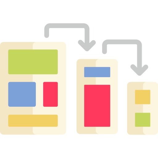
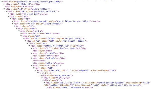
Layouts are basically a mess
{ float : right }
{ position : absolute }
{ display : table }
@mjordancodes


@mjordancodes
How can we handle all these devices and avoid div soup?
@mjordancodes

{ display: flex }
The Flexible Box Module, usually referred to as flexbox, was designed as a one-dimensional layout model, and as a method that could offer space distribution between items in an interface and powerful alignment capabilities.
@mjordancodes
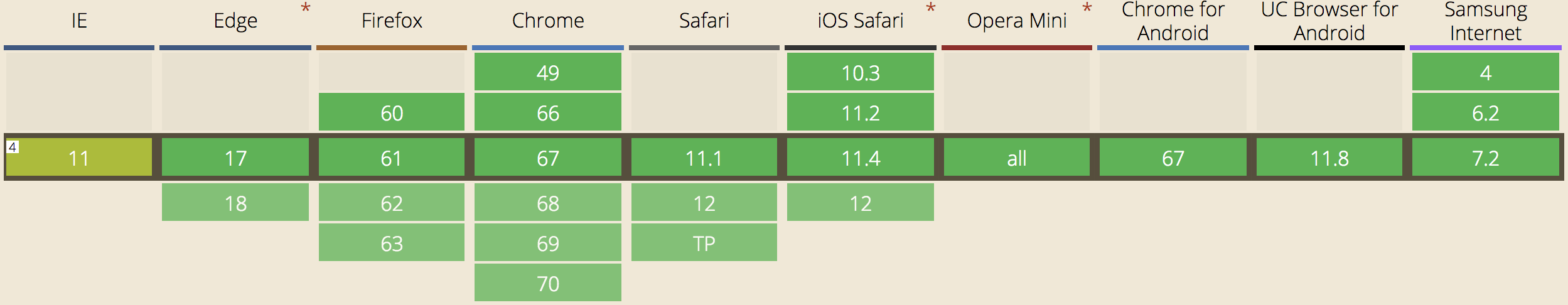
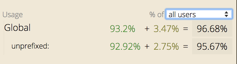
Can I Start Today?
@mjordancodes
@mjordancodes
Flexbox Vocabulary

.container {
  display: flex;
  flex-direction: row | column;
  flex-wrap: wrap;
  justify-content: space-between;
  align-items: stretch;
}
.item {
  order: 1;
  flex-grow: 4;
  flex-shrink: 1;
  flex-basis: 5em;
  align-self: flex-end;
}
flex: 0 1 auto;
@mjordancodes
Let's Try It!
Flexbox NavBar
@mjordancodes
@mjordancodes
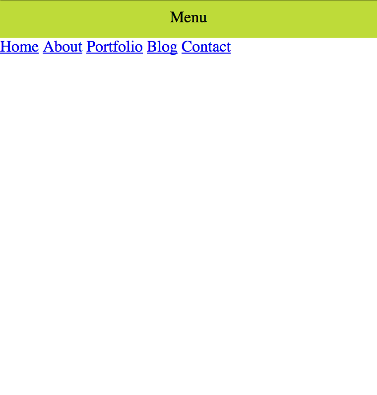
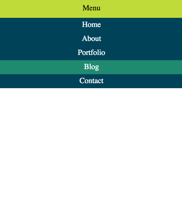
<nav>
  <span class="menu-toggle">Menu</span>
  <div class="menu-content">
    <a href="#">Home</a>
    <a href="#">About</a>
    <a href="#">Portfolio</a>
    <a href="#">Blog</a>
    <a href="#">Contact</a>
  </div>
</nav>
Some simple HTML to start...
@mjordancodes
body {
  margin: 0;
  padding: 0;
}

.menu-toggle {
  padding: 10px;
  display: block;
  text-align: center;
  cursor: pointer;
  background: #BEDB39;
}
CSS to start things off
@mjordancodes
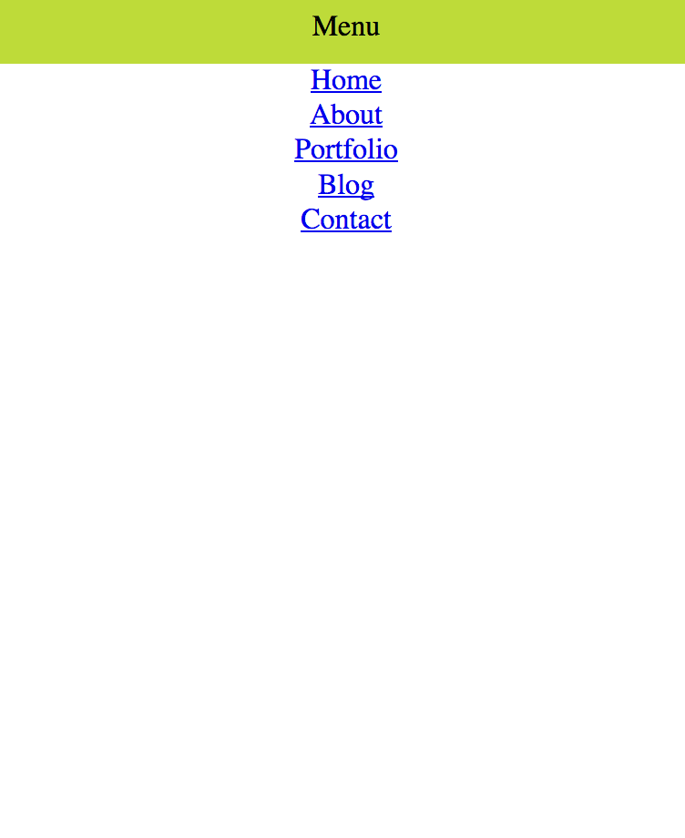
.menu-content {
  display: flex;
  flex-direction: column;
  align-items: center;
}
Starting to Flex the things
@mjordancodes
.menu-content {
  display: flex;
  flex-direction: column;
  align-items: center;
}

.menu-content a {
  padding: 5px 0;
  background: #004358;
  width: 100%;
  text-align: center;
  color: #fff;
  text-decoration: none;
}

nav:hover .menu-content a:hover {
  background: #1F8A70;
}
And a little bit of pretty hovers
none;
nav:hover .menu-content {
  display: flex;
}
@mjordancodes
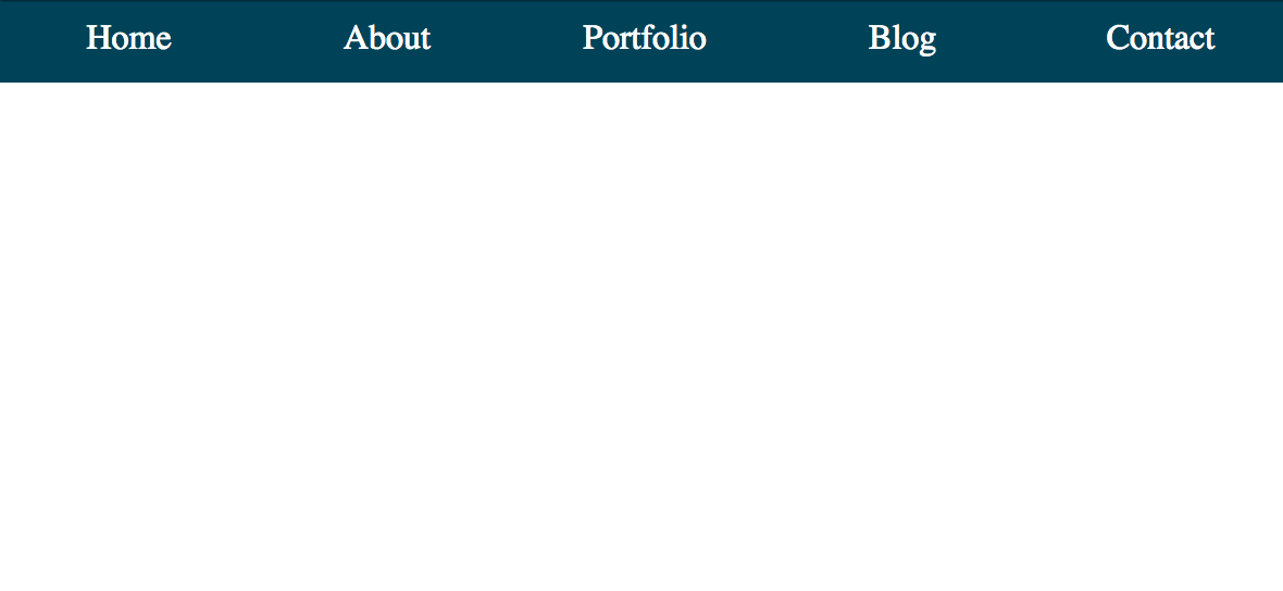
@media screen and (min-width: 400px) {
  .menu-toggle {
    display: none;
  }
  .menu-content {
    display: flex;
    flex-direction: row;
  }
  .menu-content a {
    padding: 10px 0;
  }
}
Responsive Time
More Flexbox!
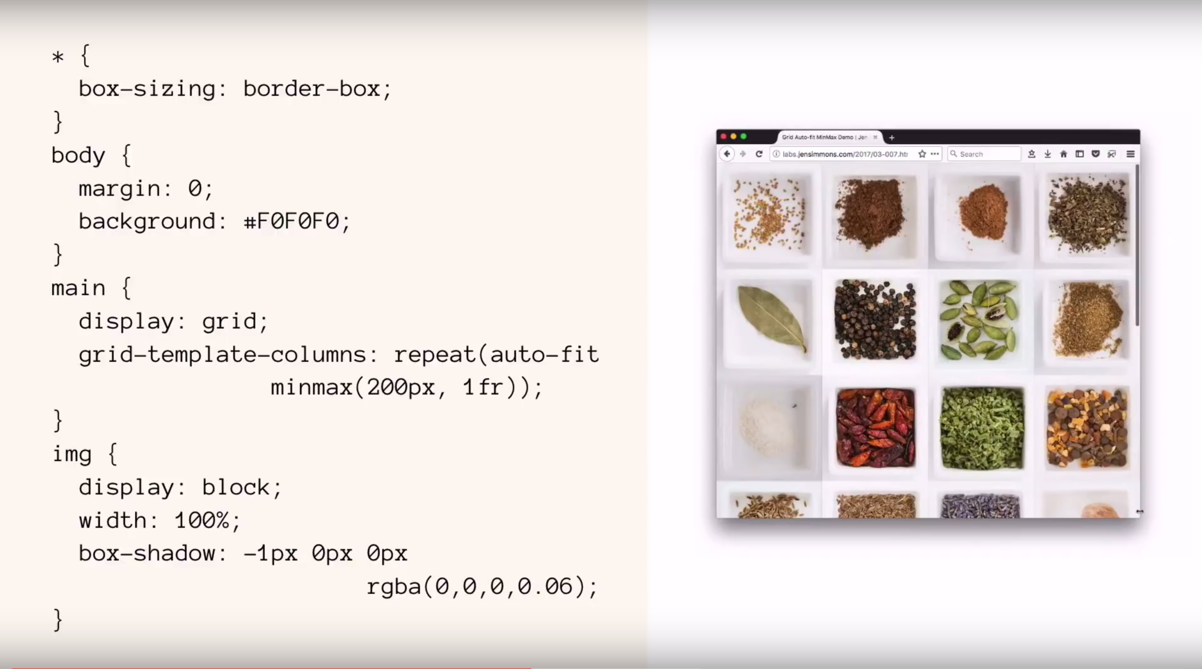
{ display: grid }
CSS Grid Layout excels at dividing a page into major regions or defining the relationship in terms of size, position, and layer, between parts of a control built from HTML primitives. Grid is for working in two-dimensions.
@mjordancodes
Can I Start Today?
@mjordancodes
@mjordancodes
@mjordancodes
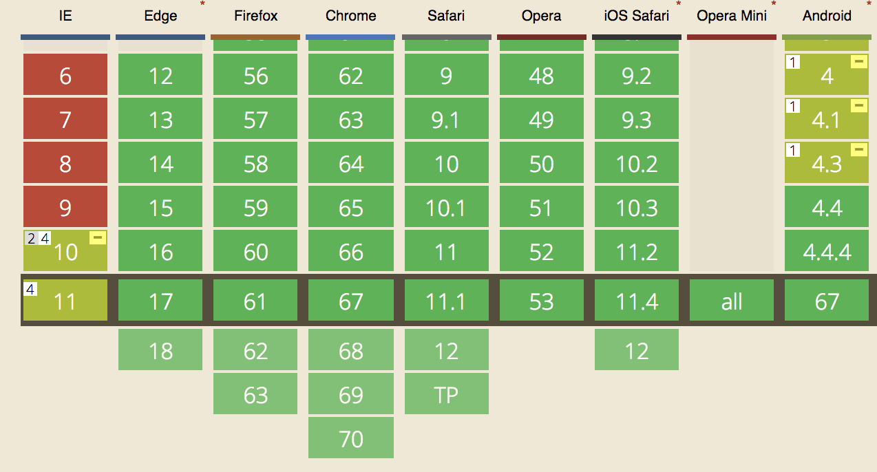
Fallbacks for Older Browsers
New Grid Units
min-content
max-content
fr
minmax( )
@mjordancodes
.grid {
  display: grid;
}
@mjordancodes
.grid {
  display: grid;
  grid-template-columns: repeat(4, 1fr);
}
@mjordancodes
.grid {
  display: grid;
  grid-template-columns: repeat(4, 1fr);
  grid-template-rows: 100px 200px;
}
@mjordancodes
.grid {
  display: grid;
  grid-template-columns: repeat(4, 1fr);
  grid-template-rows: 100px 200px;
  grid-gap-columns: 10px;
  grid-gap-rows: 5px;
}
@mjordancodes
Explicit Grid vs. Implicit Grid
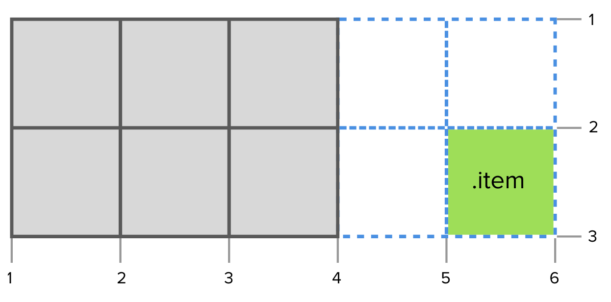
@mjordancodes
1
2
3
4
-4
-3
-2
-1
@mjordancodes
.grid {
display: grid;
grid-template-columns: repeat(3, 1fr);
grid-template-rows: repeat(4, 25px);
grid-template-areas: "a a a"
"b b c"
"b b c"
"d d d";
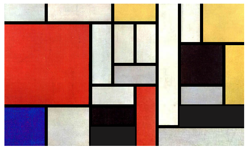
}Grid or Flexbox?
or floats??
@mjordancodes
@mjordancodes
@mjordancodes

@mjordancodes
@mjordancodes
More CSS Grid in the Wild:
@mjordancodes
Rachel Andrew
Jen Simmons
Know these humans. They are AMAZING. Read their blogs, newsletters, and books, checkout their code, learn from their videos.

Links
Complete Guide to Flexbox --> https://css-tricks.com/snippets/css/a-guide-to-flexbox/
MDN Flexbox Concepts --> https://developer.mozilla.org/en-US/docs/Web/CSS/CSS_Flexible_Box_Layout/Basic_Concepts_of_Flexbox
Flexbox
MDN Flexbox Intro --> https://developer.mozilla.org/en-US/docs/Learn/CSS/CSS_layout/Flexbox
CSS Reference --> https://cssreference.io/flexbox/
W3C Flexible Box Specs --> https://www.w3.org/TR/css-flexbox-1/
Course: What The Flexbox? --> https://flexbox.io/
Flexbox Froggy --> https://flexboxfroggy.com/
@mjordancodes
Complete Guide to CSS Grid --> https://css-tricks.com/snippets/css/complete-guide-grid/
MDN Grid Layout --> https://developer.mozilla.org/en-US/docs/Web/CSS/CSS_Grid_Layout
CSS Reference --> https://cssreference.io/css-grid/
W3C Grid Layout Specs --> https://www.w3.org/TR/css-grid-1/
Course: CSS Grid --> https://cssgrid.io/
Grid Garden --> https://cssgridgarden.com/
CSS Grid
Learn CSS Grid --> https://learncssgrid.com/
Grid By Example --> https://gridbyexample.com/
Layout Land --> https://www.youtube.com/layoutland
Flexbox or Grid --> https://rachelandrew.co.uk/archives/2016/03/30/should-i-use-grid-or-flexbox/
Links
Implicit & Explicit Grid --> https://css-tricks.com/difference-explicit-implicit-grids/
@mjordancodes